Keys to Positive First Impressions in Commercial Design: Color
Posted in Color, Commercial Design, Interior Design on June 23, 2017
How do you want the space to feel?
Positive first impressions of a building are based on feelings – when people enter they have an immediate reaction as to whether they want to linger or leave.
Color has the power to convey many different feelings, and can set the tone for whatever ambiance you want to create in your commercial space.
KEY # 2: COLOR
Color is key to first impressions because it can immediately evoke positive reaction.
Color can:
- Be energizing
- Feel fresh
- Create warmth
- Make people at ease
- Initiate fun
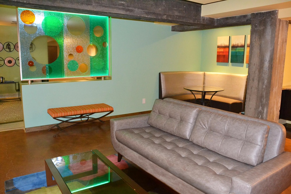
In this Residents Lounge at West Calhoun Apartments, bright and fresh paint on the walls, accented with colorful acrylic and canvas artwork contrast with dark exposed beams and reclaimed wood for an edgy, fun look. Warm brown stained concrete floors ground the space.
More Color Tips
For a soothing, nurturing space
- Paint the walls a soft beige, taupe or subtle green
For a bold or energetic atmosphere
- Use mustards, deep reds and burnt oranges
To balance a space
- Accent with cooler colors such as deep blue or sky blue
BEST TIP: Experiment with a few colors before ordering enough for the space. It can be tricky to coordinate, especially the more bold you go, so reach out for a Color Consultation if you need expert help.
One thought on “Keys to Positive First Impressions in Commercial Design: Color”