Nealon Dining Room
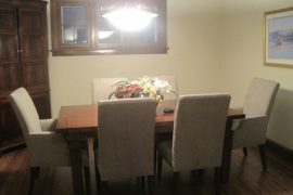
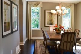
Viewing the “Before” photos, you can see that this dining room wasn’t in terrible shape, but with design efforts infused with Feng Shui, we were able to create a room that is much more intriguing, and one that our client now uses and enjoys.
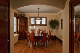
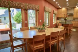
Our client knew something was wrong before; the room just didn’t feel right. The rectangle-shaped table, the most prominent piece of furniture in the space, was being used as a workspace. It collected papers instead of being used for a place to eat. We conveyed two things that would help the Feng Shui of the room: 1) the dining room should be used for its primary purpose (dining), and kept clear, as this supports the wealth of the homeowner and 2) having a round dining table instead would not only open up the space, making it more inviting, but round shapes allow guests to feel relaxed, as opposed to confrontational.
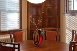
The client’s older home has traditional architectural details, but to fit his style we brought in contemporary features that complement, achieving an eclectic look.
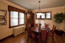
The windows, formerly bare, made the room feel cold. Hunter Douglas Silhouette® window shades were added to softly filter light, and a curved cornice top treatment in a contemporary fabric also adds warmth. This establishes as better Yin/Yang balance in the space.
The ceiling was painted light blue. Cream walls and off-white trim are a soft backdrop for art that pops with color and a new mirror, which also contributes to the homeowner’s wealth luck. It’s different from the homeowner’s previous antique gold-framed mirror, (see second Before photo) being larger, with a bronze frame. The silk birch tree and floral bring touches of nature inside, also good Feng Shui.
Overall, our client was very happy with the results, saying they’ve changed the way he lives.
