Omega Property Management Office
Feng Shui design principles aren’t just for the home. It is equally important to create good energy in the workplace, where there’s a need for concentration, collaboration, and creativity. Recently I updated the new corporate office space of Omega Property Management in Maple Grove, Minnesota; this was a move for the company to grow and expand. Here is how I livened the space and created better flow for increased productivity and happiness.
Lobby
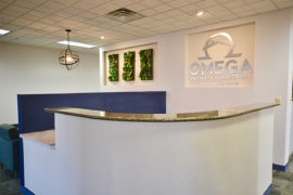
- The 2020 trend colors matched perfectly with the company’s logo – pewter green, navy, soft off-white, and gray. In Feng Shui design, white helps people concentrate. But you still need some color to add life.
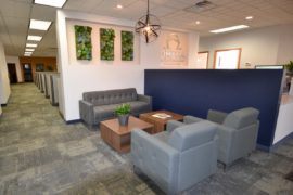
- These colors are reminiscent of nature. Biophilic design, a concept based on the research and findings of biologist Edward Wilson, connects people to nature in their interiors, which has a positive impact on their health and well-being. The faux wall planters add a natural touch.
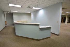
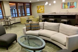
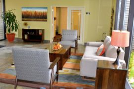
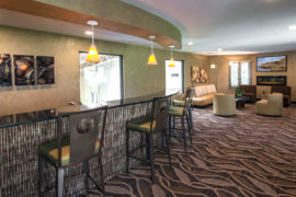
- To create a welcoming area and more seating for waiting clients, the space was divided, allowing for plenty of room for the receptionist’s work area.
- To soften the space, I rounded the wall in front of the receptionist’s desk. In Feng Shui design, sharp angles, particularly those pointed directly at a person when they enter a room, are called Sha Chi, or poison arrows. They can weaken your energy.
- The countertops on the upper part of the receptionist’s desk are Cambria and the lower work area is laminate. This allowed for cost savings while also adding a dressed-up look.
- Mid-century modern furniture was added to the reception area as well as recessed lighting in the ceiling to tone down the fluorescent lights, creating a welcoming atmosphere. A decorative light fixture was added to give visual interest and help separate the reception workspace from the waiting area.
Workspace
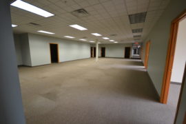
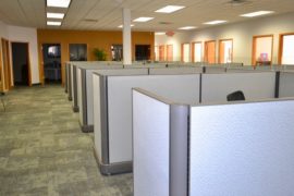
- To save money, I found refurbished cubicles in gray tones – they were just like new!
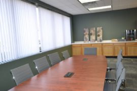
- The conference room got a biophilic design boost with a pewter green wall and carpeting in the trending colors of blue, gray, and soft green.
- While we did reuse most of the furniture in the conference room, the company upgraded the conference chairs.
Breakroom
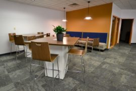
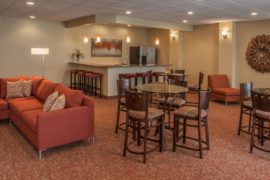
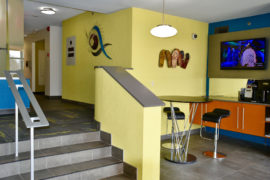
- To create a more relaxed workspace and a place to eat and take a break, we opened up a whole wall.
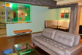
- The booths in the back not only add a space to take a break or eat lunch, but offer an informal space to have collaborative meetings.
- The deeper caramel wall color is a great complement to the rest of the color scheme.
Let me know how I can help you make your corporate office space work better for you – Contact me for a consultation.
Warmest Regards,
Julie Ann
